Formatting poems in WordPress or with HTML is problematic, as any journal editor or website owner probably knows. Poetry coding presents the following challenges:
- Spaces cannot be replicated with tabs or the space bar as they can with Word
- It’s hard to control where a line wraps and line breaks matter
- Responsive design means scalability, it’s easier to control fixed elements
- Poetry may break the layout and div relationships of a page
- The line height is rarely going to match the intent of the original
- Redesigning an entire page to accommodate a poem is a lot of work and sometimes not possible, depending on the skill level of editors and permissions and controls in the WP installation
- Responsive design is possible through wrapping of elements, which counters wanting to control line breaks
- Even if you get it right on the desktop, it likely won’t look good on mobile
- Not all WP installations have fine-tuning controls or ways to update the code to preserve the poem format
- It is never going to be right on all devices
- There won’t be a solution that’s replicatable for all poems
- Cut and pasting from Word is risky and often results in strange characters appearing somewhere
I’m going to share a couple of techniques for how I format poetry in WordPress, one with HTML and the other with preformatted WordPress blocks. Know that the latter will require adjusting your CSS, in the block control panel “CSS styles addition” panel or in your dashboard “appearance add CSS” interface. Also, if you’re a poet, consider if you want your poems to look good online across all devices, the best way is to write short lines and align your poems to the left.
A word about pasting formats from Word into WordPress, even if they appear good on some screens, they are likely going to have improper line breaks, wrong spacing, or in the event of editors pasting directly from Microsoft Word or other word processing programs, there might be weird characters displaying in someone’s browser. Pasting from Word is never recommended.
*Note that some of the text that follows is in screenshots (where captioned) and some are HTML. This might be confusing, but nearly all the screenshots are outlined in black.
This article mostly pertains to desktop views, but I do address poetry for mobile phones towards the end. The HTML views are OKAY on desktop, but there are some line breaks to fit on mobile. The <pre> tag is not as good a solution as HTML if you want the poetry to read as intended on mobile. The preformatted blocks work pretty well on both tablets and on desktop computers, however.
The issue with long lines in the case of HTML poetry and <pre> formatted poems is they can interfere with the containers built into the page design and extend beyond the margins, making it ugly as a design, or problematic, depending on your theme (CSS). Wrapping text is the normal solution to this design/web problem, but poets care about line breaks.
This is a poem fragment screenshot from an open Word document

The above is a screenshot of a fragment of a poem from Word. I’ll use this throughout this article as I show ways it might be replicated. Note the dotted lines are Word margins. Some of the following information will translate into other CMS systems or page builders like Wix and Squarespace, provided you have access to the HTML and CSS.
This is a poem fragment pasted from Word directly into WordPress
she dreamed

between my thighs, a flecked gray steed, 		sweeping reckless, across an amber field / my long hair streaming behind / too late to save you

it was the 1300s / always a bad outcome

the only time I don’t feel unhappy is when I’m writing and my mind is completely occupied
Note that the spacing above matches the current website style, which does not look like the original one. If you were trying to match the author’s presentation, you’d likely have to dig into the code and adjust the leading, which would look something like this:

If you think this is a lot of monkey business, you are correct. And, unfortunately, the average indie journal doesn’t have someone on staff who knows how to do this. To learn more about coding line height, check out this cool interactive page on Mozilla.
This is a poem fragment created with non-breaking spaces using the WP HTML block and coding
she dreamed
beween my thighs, a flecked gray steed, sweeping
reckless, across an amber field/my long hair streaming behind/too late to save you
it was the 1300s/always a bad outcome
the only time I don’t feel unhappy is when I’m writing and my mind is completely occupied
Note the “double” spaces were achieved by the use of paragraph tags at the end of each line. The single space was made by omitting. &emsp is four spaces.   is one space. &ensp (not shown) is two spaces. For a complex poem with varied spacing, this is a whole lot of monkey business, and it won’t prevent lines from wrapping on your phone.
This is a screenshot of the code required to make the poem fragment shown above
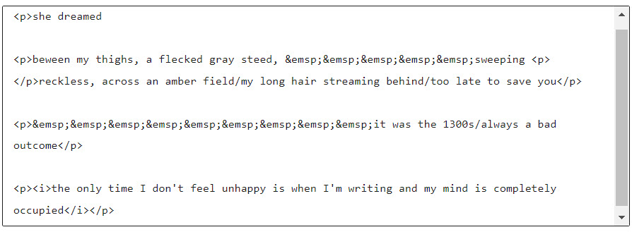
The worst thing about formatting poetry this way, is you can’t see what it will look like when coding. You have to continually save your draft and use “preview” to see what it looks like.
This poem is made by pasting the Word doc into the preformatted block, which utilizes the HTML <pre> tag.
she dreamed between my thighs, a flecked gray steed, sweeping reckless, across an amber field / my long hair streaming behind / too late to save you it was the 1300s / always a bad outcome the only time I don’t feel unhappy is when I’m writing and my mind is completely occupied
<pre> code or the preformatted block comes with a mono-spaced block. This is how the spacing is preserved. I have added CSS to change the font, however. Note, we have a new problem in that the block type is too large to format within the window, so line breaks are incorrect. You obviously don’t want to restyle every page to accommodate the block width. Missing also is the italic styling, and the spacing is messed up.
I don’t recommend pasting from Word, but didn’t notice any junk appearing in the page source code once this was published. But the formatting was not preserved in the paste.
The preformatting block in my WordPress installation centered the text (not shown), so I added some code to “add styles” changing the font and alignment (to match my site styles) under the appearance section of the dashboard as follows:
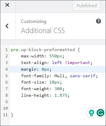
This fixed the alignment, font display, and margin problem with pre-formatted blocks. Note that the max-width does NOT work with <pre>. Overriding styles can be a complex issue for themes. If you can’t get the desired results from adding CSS, you might have to create a child theme and adjust the <pre> block style in the child theme .css file. If you did it in the .css that came with your theme, it would get overwritten when you update the theme.
Here is what the code for this looks like. Note the WordPress class for the <pre> tag:

If you haven’t deducted this yet, know that formatting poetry is a pain in the ass. But these are techniques you can try while knowing there are limitations. You may not have access to style sheets, depending on your user privileges and your host, as many hosts limit the controls on what users can do and which files they can access. But keep reading for more tips.
This example uses the pre-formatting block again with the poem hand typed
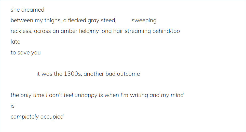
There is still a problem here as the box is not wide enough for the text line, so it’s wrapping improperly. You can set up the CSS to cut off the extra, but that wouldn’t be a good solution for poetry, obviously. The solution, an imperfect one, is to add CSS for padding and the right margin, which looks something like this:
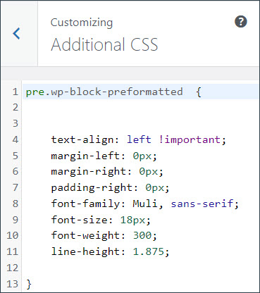
Poem fragment with outside margins added to accommodate line width
she dreamed
between my thighs, a flecked gray steed,          sweeping
reckless, across an amber field/my long hair streaming behind/too late
to save you

                 it was the 1300s, another bad outcome

the only time I don't feel unhappy is when I'm writing and my mind is
completely occupied
The above example is as good as I’m going to do without altering the line height, which you, of course can, but then it won’t match the style of the other text on your page. If you want this degree of control, I suggest putting the poem in a light-colored box and maybe using a slightly smaller font, or even a different one, just for poetry.
One additional thing you can do with preformatted blocks is style the boxes using the sidebar controls. You can also change the type size and the space between letters without coding. I’m going to change the style of the same box as above using these controls.
Here I have made the font smaller, the background gray, and changed the type color using the block controls, as seen below (note I’ve been notified these are not good color combinations. Also, despite the smaller text, this still will not stop wrapping on a phone. The lines do not fit a phone’s width.
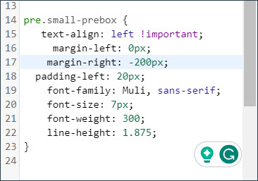
CSS to make this fit on a phone screen without wrapping
she dreamed
between my thighs, a flecked gray steed,          sweeping
reckless, across an amber field/my long hair streaming behind/too late
to save you

                 it was the 1300s, another bad outcome

the only time I don't feel unhappy is when I'm writing and my mind is
completely occupied
In order to make this fit on a phone without wrapping, I made the font really small, 9 px, and used negative margins on the right to make the text not wrap. The usual wrap CSS did not work. Note that this styling on a desktop leaves huge amounts of extra space on the right-hand side, but if you make the color the same as the background color, you won’t notice.
What does this mean? That you have to make two versions, mobile and desktop, or make the font smaller on the desktop, which isn’t very accessible. The WP built-in font controls for mobile, while responsive, do not make the poem display properly. And know that fixed font and margin solutions to displaying poetry, also aren’t responsive. The beauty of responsive design is the scalability and responsiveness. A lot of this is about wrapping, which is what poets do not want.
Note that my problem solving here was for my own website. Some of these problems will be alleviated somewhat by using full-width page design for displaying your poems. Also, the width of the main body on your site could be much smaller than this, especially if you are publishing post-style with a sidebar taking up some of the screen real estate.
The same poem block as above with a white background
she dreamed
between my thighs, a flecked gray steed,  sweeping
reckless, across an amber field/my long hair streaming behind/too late
to save you

       it was the 1300s, another bad outcome

the only time I don't feel unhappy is when I'm writing and my mind is
completely occupied
Note that I first selected the preformatted block, then gave it a class in the right-hand “add CSS classes” box, then I added this to “additional CSS” under appearance on the dash. Making negative margins isn’t really best-practice coding, but I occasionally do it in a pinch.
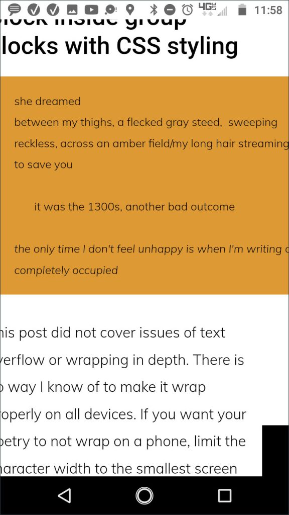
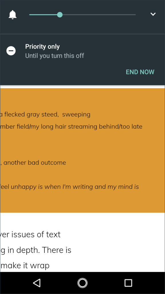
Here are two phone screenshots of the poem block (in orange for visibility). You have to scroll to read the lines as they don’t wrap because the negative margin gives them the room they need. In terms of aesthetics, I would rather have the poem wrap lines incorrectly. Line breaks are something poets feel strongly about, but the effort to try to make a poem look good on every device is TIME CONSUMING, and there are always aesthetic compromises to be made somewhere, which is why some journals only consider left-aligned poems (or they use images instead).
Poem with wider letter spacing and smaller line height
she dreamed
between my thighs, a flecked gray steed,  sweeping
reckless, across an amber field/my long hair streaming behind/too late
to save you

       it was the 1300s, another bad outcome

the only time I don't feel unhappy is when I'm writing and my mind is
completely occupied
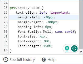
As a final obsessive tweaking with a bit of creativity indulgence thrown in, I changed the letter spacing to 5 pixels and the line height to 150%, the latter using a custom class and CSS. This doesn’t exactly replicate the feel of the original, but it does look kind of cool. The ugly part is it extends beyond the pages natural margins, but the page design could be aligned in such a way this wouldn’t be noticeable.
I also changed the margin to make it inline with the body text. The beauty of this is you can reuse the styles, but know that long line-length poems will be problematic on any device, and if writers want to look good on mobile, the best thing to do is write short lines. Here’s the revised code:
This post did not cover issues of text overflow or wrapping in depth. I did not use any real text wrap code like white-space or the values that impact wrapping because none of them worked in the <pre> tag. I believe if I put the pre-formatted block inside a div and set the div white-space values to either pre or nowrap, this might have worked, but that’s for another blog post.
There is no way I know of to make it wrap properly on all devices in all instances without writing separate code for each. On mobile, you have to consider the smallest common denominator (smallest screen size), which entails, in many cases, making things too small to read. If you want your poetry to not wrap on a phone, limit the character width to the smallest screen size (which is around 320 pixels) and use a small font, as shown above. Because you can’t control what the font settings are on someone’s website or on people’s devices, much of how it looks is out of your control.
What are most online journals doing? Probably cut and pasting from Word, which, as I explained, will yield erratic results.
So what’s the best way to format poems in WordPress then?
Using non-breaking spaces in HTML is tedious, but gives you some control as you can end paragraphs and you have limited control over line spacing. However, the beauty of using a preformatted WordPress block is that you can use the spacer bar to adjust text, so once you adjust your CSS, you can type the piece in and adjust the spacing visually.
The shortcoming of preformatted blocks has to do with text wrapping and flow, but line-break issues are also related to screen widths, font settings, and device limitations, many of which you cannot control, so you have to accept there is no perfect solution to formatting poetry for online viewing.
One more option for using <pre> tags or the WordPress block is to set it up to scroll. This handles overflow problems in the case of fixed-width “containers” or divs, but it is not attractive and will not match the style of your website. Know that there are block controls to modify things like type size and background in the right-hand block control panel, along with the aforementioned additional CSS classes which might work on your installation. This allows you to style a block without impacting the style of the rest of your page. You can write styles inline using an HTML editor or write in the “appearance” choices on the WP dash.
Display poems online using images
The final way to format poetry is to use a graphic. If you’ve ever tried to format poetry in Photoshop or some other program, it is also a pain, but here’s a dirty little secret, add your website body text font to your computer, format the poem in Word (or your word processing program, and screenshot it using some free tool, and you have a graphic. Make sure to crop it so the margins match your website styles. You can set a template and guides to do this in some software programs and reuse it later.
The best file format for hard-edged graphics is GIF or PNG. JPEGs are better for photos and tend to make clean graphics look fuzzy.
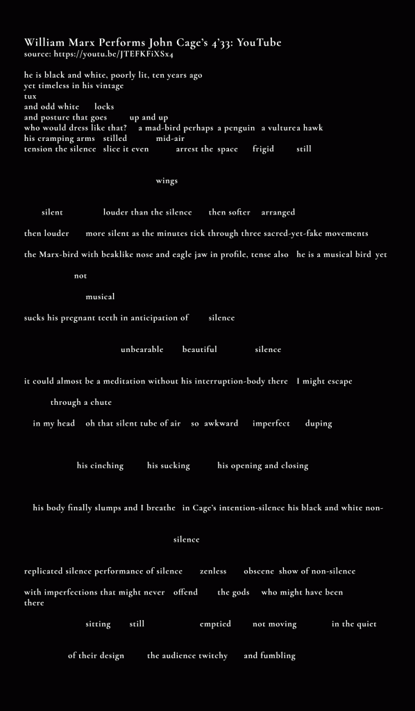
Here is a link to a publication in 433, “W. Marx Performs John Cage’s 4’33: YouTube,” where the poem was too sprawling for their web layout. I made this graphic using their fonts. It isn’t exactly a match to their body font. They made it clickable for a larger version. Making it fit into their layout would’ve made it illegible, and a piece this sprawling just isn’t built for phone viewing. I was fine with this solution. Note that their clickable image is more legible than this. The font style is pretty small, and a bit hard to read on black. See my typography blog post for more about fonts on the web. And see a large version of this in Open Sans on a square background here.
The shortcoming with this method is the graphic may not scale or be readable the way you want it on small devices and the font scaling won’t match your page whether you have fixed-size fonts or scaleable ones (like em). Again, there’s no perfect solution to formatting poetry for WordPress or for any online publishing venue, but this is probably the quickest.
A few other tricks
Other things to try, and this isn’t very responsive, is creating fixed-width containers with pixel-based fonts and no-wrap tags. This, again, requires coding, but there are likely plugins or even page designers that give you some WYSIWIG control (and probably bad code!). Responsive design and traditional poetry were never meant to marry, but maybe allowing poetry some fluidity to match the contemporary digital scape can be a segway into something creative and engaging.
The takeaway
Trying to format poetry, while tricky and sometimes tedious, can be fun if you like experimenting. While this article was written as a way of sorting out the issues of type scale, margins, and text wrapping, it evolved into something a bit more creative (yes, coding can be creative too).
If you want to preserve formatting in an existing web page layout, you’re likely to run into problems with page margins. Editors usually aren’t web designers, and many WP installs (especially WordPress.com) have limited controls for formatting pages.
Using the preformatting block allows visual spacing of letters, but styling options are limited, and it becomes more complicated trying to get it to work on mobile. Fixed-width solutions make a design less responsive and elements are likely to break out of their containers in the instance of long lines. Also, will a mobile reader always know to keep scrolling to the right?
HTML in large doses can be tedious, but you can write inline CSS and get a fair amount of control over the appearance. But what if a journal doesn’t have someone who can code?
In the visual arts, there is the concept of ideal viewing distance. In the case of most things, being relegated to a phone screen is not it! So be a perfectionist, if you need to be. I’m not sure I got the scale right on the GIF 4’33 poem iterations, but, well, we need to have fun too!
If you need an author or other website designed, check out my services page and connect on social!
And if you have other ways you code poetry and you’d like to share, please leave a comment! I’d love to hear it!

