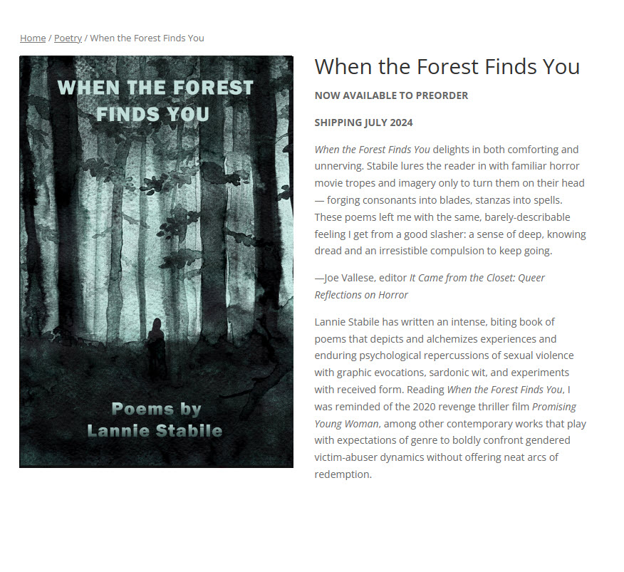
Lannie Stabile’s awesome new book, When the Forest Finds You is available for pre-order! I was honored to design the cover for it. Published by Variant Lit, the chapbook follows several of Lannie’s other books including Good Morning to Everyone Except Men Who Name Their Dog Zeus. This book is a unique hybrid of poetry, horror, and trauma. It’s definitely an interesting read. Pre-order at Variant Lit.
Design
Self-Publishing is Publishing Too
It has been a very busy month, so I thought I’d do a quick post with some links to things. But along with these publications, I want to share that I’ll be doing more self publishing, along with producing some prints, and further off, some broadsides. Please keep me in mind if you have a broadside project. I’d love to work together.
I have self published in some form since I was very young from the third-grade comic books, to punk art xerox books made in college and after. But in recent years, I got on the hamster wheel of publishing in journals, and as you probably know, it can be EXHAUSTING!
I’m not knocking it. I appreciate all the labor that goes into publishing, and am super-grateful for my publications. It is nice to see your work in print, online, and to get the recognition and approval that comes with it–and, of course, benefit from the readership a journal has built. I will still publish in zines. I’m not quitting. Just considering other ways to get work seen.
Mythic Picnic, a Twitter Zine (see my publication link below) also got me to thinking about alternative ways to publish work. I think publishing on social is really fabulous and empowering. You should check their account and see what they’re up to (and maybe even send them something. They consider previously published too.
A couple of writers reminded me of what is great about DIY print publishing. Those writers are Jimmy Broccoli and Angel Rosen. Both publish their own poetry books, and Jimmy also publishes anthologies of writers he likes.
Services like Lulu have made it really easy to self publish–and no I’m not endorsing them as a service. But some of these services even allow publishing from Word. No InDesign skills necessary.
I’m getting a little ahead of myself. I do not have a book I’m publishing yet (I do have a book Diode is publishing in the fall), but I will most likely be publishing an asemic art book–plus I have some prints in the works, which will be listed here on my website once the details are ironed out. Plus, I’ll be offering packages with my Diode book coming out this fall.
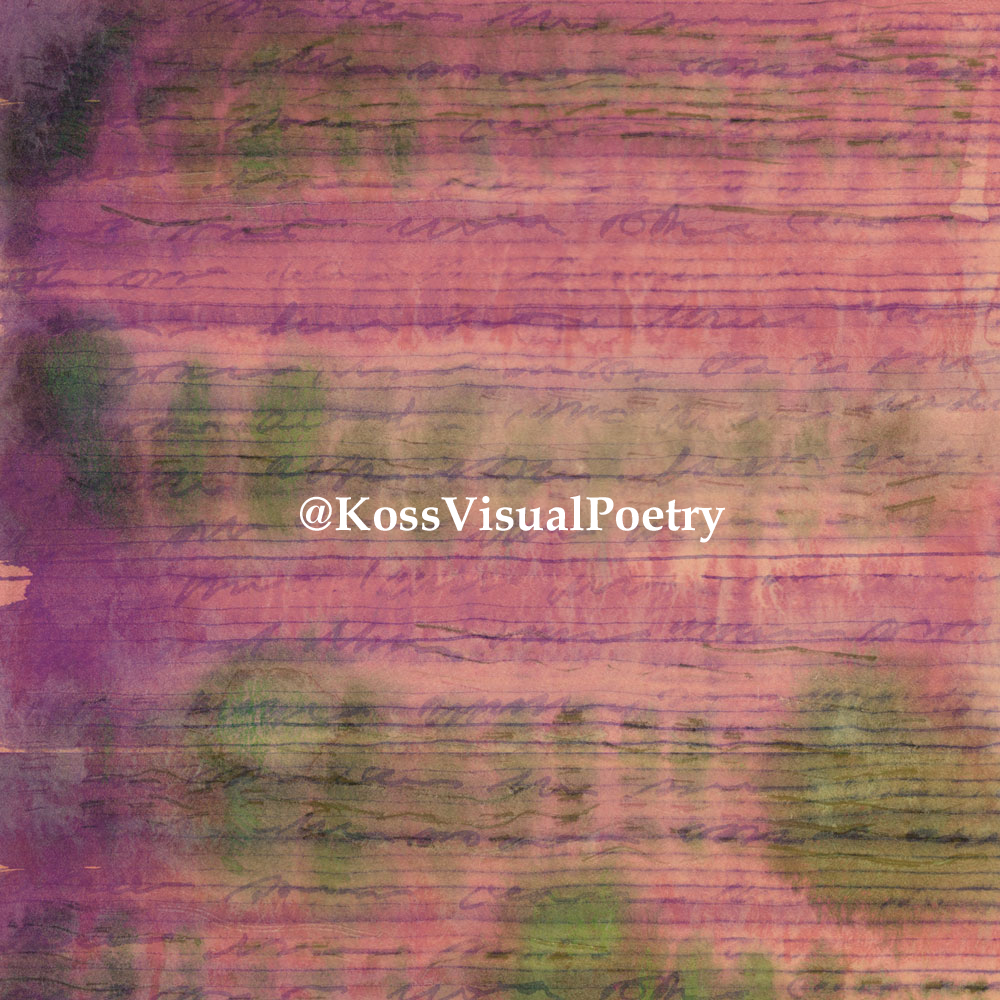
So my less ambitious self publishing project is just that I’m going to be publishing more visual work online, both here and on social. I created an additional Insta account. This one, for now, is public. Please follow it here if you need some visual pleasure in your mornings (perusing art on Insta is one of my favorite activities). Koss Visual Poetry should be interpreted in the broadest sense. Consider I’m a hybrid writer with blurry boundaries, although I like to think my real-life ones are fairly intact. All of the works will have a visual element, even if they are concrete poems… Think erasure poems, collage, my crossword puzzle poems, and asemic art.
The coolest thing about online publishing for art is that artists get to show their work without it having to be legitimized by dealers. And there is potential to reach much bigger audiences, and not share fifty-percent with dealers.
Also, did you know that you can self nominate for Best of the Net when you publish on a blog (writing and art)? Most journals don’t nominate for art, so there’s that. And Winning Writers hosts an annual contest, The North Street Book Prize, for self published books with multiple genre categories (I’m sure there are other contests out there also). I believe you can submit to some Lambda prizes too… Also, there is the Eric Hoffer Award, which is open to small presses and self-publishing authors. So maybe you don’t have to wait and hope for a nomination. It’s okay to be a bit proactive about your work.
Self publishing is personally empowering. No Submittable or fees. No waiting. No lost submissions. It’s immediate gratification with no anxiety, no rejection.
And now, the promised links to April pubs. Thank you lovely editors for the publications. And see you, readers, on social. Thanks for stopping by!
- Mythic Picnic (a bunch of flash/micros/short work
- Reckon Review (a sort-of craft essay)
- Bulb Culture Collective (a poem about labor and environment, download or view HTML)
- Midway Journal (a new flash piece)
- Anti-Heroin Chic (five photographs)
And don’t forget to follow my new Insta account. And if you have any thoughts about self publishing, feel free to share in the comments.
Typography Tips for Self-Publishing, Journals, and Indie Presses
Fonts come loaded in our software and ready to flaunt their beauty and authority as our fingers fly over our keyboards. We take this magic for granted, and we might feel like font masters as they are so part of our daily existence, but knowing how to use Word doesn’t make us fabulous designers, just as we’re not great writers because we know how to construct sentences. In this democratized digital age, there is a tendency for us to confuse our gadgets’ attributes with another kind of expertise. Another example: a fabulous lens does lend itself to good photography, but it doesn’t provide the other elements of good design. Garamond is a beautiful font, but you can destroy its virtues with a few common typographical errors—ones we see on the internet every day.
*Note: scroll down to read the entire article, or use these quick links to skip to sections, or click to skip to the summary.
I’m glad you’re still with me. Keep reading, and I’ll share a few super-simple tips—some dos and don’ts, to make your websites, poetry, and books look TONS more professional—without having to fork out any money to designers. Also, I’ll bet many of you do, in fact, have a natural design sense. Learning just a few typographic conventions will take your design to the next level.
Selecting Fonts for Web vs. Fonts for Print
Generally speaking, serif fonts work better for print than for the web. Studies have shown that non-serif fonts are easier on the eyes and easier to read on backlit screens. They’re also more readable for people with vision issues. Serif fonts, on the other hand, help anchor the eye on the printed page when used in print.
You’ll see online newspapers using them, but this is really a carryover from print, and many now use sans-serif for the body. While the resolution of computers has increased considerably over time, making it easier to read serif fonts on full-sized screens, over half of people now read off mobile devices. Whenever you’re designing for the web you need to consider mobile. Sans-serif for mobile is indisputably easier to read.
Fonts and Accessibility
San-serif or Serif Fonts?
Know that using sans-serif fonts on the web is not a hard rule, but if accessibility and readability are a big concern, and they should be, you may want to go with a sans-serif font. Accessible fonts are simply designed and include Calibri, Helvetica, Arial, Verdana, and Tahoma. Sans-serif fonts have a more modern appeal, whereas serif fonts are more elegant. Be true to your brand or content, but be judicious in how you use each online.
Web Font Size
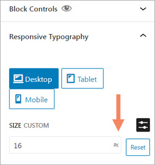
Another usability consideration is size. There is no standard size, but setting the font in em changes the size in relation to other page elements. Rem, another good option, makes for font scaling in relation to the root element. To be accessible, users should be able to scale to 200%, and the above options give readers the ability to scale on any device or platform. But what does that mean for the average person putting together a journal page or author site? Use ems or rems if you can, but if your content management system only allows fixed absolute measurements (and not ems or rems), 16 px would be a good ballpark. Know that pixel measurement differs from font to font.
Font Color and Contrast
Font color and contrast are the other keys to readability. Some colors and color combinations can be harder to read, especially when they are bright or light colors. Low-contrast colors especially impact older folks who may who low contrast sensitivity. Also impacted are people with color blindness. White text on black is also hard to read. Also, too much contrast is hard to read, but generally, high contrast is conducive to readability.
There are industry recommendations for contrast percentages (read more here and here), but also, use common sense. If your text disappears into a busy image or a similar color, it’s less than ideal. If it’s a strain for you to read (and you have good vision), it’s worse for someone with sight issues.
*Read more about fonts and accessibility in this Google article.
Other Font Color Considerations
Along with contrast, restricting color choices makes for a better design, whether your design is a bold contrasting one or made of harmonious “neighbor” colors. Whether designing for a book, a project, or the web, limit your color choices to a few and stick with those styles. Did you know that many painters restrict their palettes to three or four colors (plus black and white)? You may not be completely conscious of this, but often you will have a sense of something holistic that just “works” when viewing these artworks. Piet Mondrian’s “Small Birch Forest” is an excellent example of color restraint, as were Picasso’s “Blue Period” paintings. For your own web color palettes, there are color tools online such as the Adobe Color Palette Generator to aid you in selecting schemes. Choose from harmonious, complementary, analogous, triads, or other color combinations.
Designing on a Grid
Our eyes search for continuity and patterns. Alignment is your friend. Think about the grid as an imaginary design structure with the visual elements (including type) sharing edges and leading your eye around the page. You can imagine or draw a grid. Some graphics programs even provide rulers. Aligning type and images gives your design a clean, organized look. One of the biggest design flaws in layperson design is a lack of attention to this. Aligning elements, along with visually balancing them, allows them to speak to each other and to the viewer.
Combining Text—Dos and Donts
How Many Fonts Are Too Many?
Just as with too much color in design, too many fonts can confuse the reader and cause visual discord. One of the key elements of design has to do with restraint/restrictions (this may sound familiar to poets). Often in print, whether fiction, memoir, or poetry, combining a serif body font with a more modern heading font provides visual interest through contrast on the page. There is nothing wrong with using a single font, however (with perhaps a bold-faced heading) in a manuscript, or in a digital journal.
CSS and Old-Fashioned Style Guides
What you shouldn’t do, unless you are creating a grunge or David Carson-like design, is combine too many font styles on a page. Limit it to two or three at the most. And if you have a website, set up font styles and stick to them. Set the styles in the CSS (or the theme controls). If you reinvent them on every page, your site loses a kind of integrity. This is the biggest tip I can offer for a more professional-looking website or journal. I’ve seen journals where editors/students/admins used a different font for each issue or article, and it makes for a really amateurish-appearing site.
Give your reader a restful experience by providing continuity and repetition in your design elements (and user-friendly navigation). You’d be surprised how much we are influenced by the way things look. That said, if you’re an Aquarian or adventurous like me, you might want to break the rules for a special article—do a funky type color—but don’t lose sight of your website’s overall design. It’s a good practice to make a style guide listing your fonts and color hex numbers. This comes in handy also when you’re making promotional graphics, and, of course, you can have matching styles for your print production and the web.
Centered Text
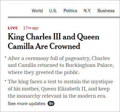
One of the most common design faux pas people make that make documents and webpages look amateurish is centering large blocks of text. I’ve seen entire pages made of centered text, and it does not look good—even when it’s Garamond or some other beautiful font. In responsive design, centered text has especially become popular, but bear in mind, most web developers aren’t typographers or even designers.
A centered quote, maybe two or three lines, is okay, but long excerpts and longer paragraphs look better aligned to the left, although sometimes aligning to the right can give a modern or edgy look (or aligning text blocks alternately left and right). Centering text is best used for headers, secondary headers (sometimes), and shortlists (like award announcements) when bullets or numbers are excluded. Know also that clean-edged type borders make for easier reading than ragged ones.
Four List Design Examples
Here are four examples of list displays using different alignments. The last list is split into two columns. Which ones appeal to you? Which are easier to read? I find the left-aligned easiest to read, partly because I grew up in the western world where I was taught to read and write English from left to right. This may be different for you, depending on your native language.
Emily Dickinson
Anne Sexton
Sylvia Plath
Emily Bronte
Vanessa Redgrave
Olive Oyl
Imelda Marcos
Isadora Duncan
Edith Piaf
Minnie Mouse
Janis Joplin
Princess Diana
Joan Crawford
Betty Davis
Joy Harjo
Joan of Arc
Christina Ricci
Bette Midler
Mary Oliver
Rachel Welch
Eleanor Roosevelt
Emily Dickinson
Anne Sexton
Sylvia Plath
Emily Bronte
Vanessa Redgrave
Olive Oyl
Imelda Marcos
Isadora Duncan
Edith Piaf
Minnie Mouse
Janis Joplin
Princess Diana
Joan Crawford
Betty Davis
Joy Harjo
Joan of Arc
Christina Ricci
Bette Midler
Mary Oliver
Rachel Welch
Eleanor Roosevelt
Emily Dickinson
Anne Sexton
Sylvia Plath
Emily Bronte
Vanessa Redgrave
Olive Oyl
Imelda Marcos
Isadora Duncan
Edith Piaf
Minnie Mouse
Janis Joplin
Princess Diana
Joan Crawford
Betty Davis
Joy Harjo
Joan of Arc
Christina Ricci
Bette Midler
Mary Oliver
Rachel Welch
Eleanor Roosevelt
Emily Dickinson
Anne Sexton
Sylvia Plath
Emily Bronte
Vanessa Redgrave
Olive Oyl
Imelda Marcos
Isadora Duncan
Edith Piaf
Minnie Mouse
Janis Joplin
Princess Diana
Joan Crawford
Betty Davis
Joy Harjo
Joan of Arc
Christina Ricci
Bette Midler
Mary Oliver
Rachel Welch
Em Dashes
Em dashes are beautiful punctuation marks that people on the web usually don’t bother with. It’s acceptable in most web writing to use a single dash, but most CMSs have special character options. Double dashes should be outlawed, in my opinion. You can also get into the code and use HTML (—), then copy and paste for the rest of the document. In this document, created with WordPress blocks, I didn’t even have to access the code to create em dashes. I just pasted the code as plain text into the paragraph text. However you do it, em dashes are great for conversational writing, and they show people you care about the details. As for print, there are keyboard shortcuts for most word-processing programs.
Margins—Use Them! Your Words Need to Breathe!
The other thing I see frequently in book publishing is crowded margins—especially too-tight bottom margins. Give the text plenty of room to breathe. By providing this visual space, you are also giving the reader mental space in which they can digest what they are reading.
Your printers generally provide guidelines for setting up the page, but the writing also dictates how much space there should be—especially with poetry. Some poems, even compact ones, may benefit visually from more white space. If longer poems need more pages, don’t ruin them by encroaching on the margins to save a few cents on printing.
Also, if the poetry lines are too long for the page, pick a larger format and spend a little more. Gutter margins require more allowance, and don’t be afraid to add a little extra margin to the bottom (yes, crowded bottom pages drive me ape). Depending on your book size, your bottom margin might need a bit more than three-quarter inches, and yet, I see many with a half inch or less.
Very small measurements can hugely impact the overall book design. Note that I’m not giving you explicit measurement recommendations here because your publishers will have their own specs (often .75″ all around with 1″ on the top, but it varies based on the outside dimensions and the publisher), but I’m hoping to encourage a discerning eye so you can visually design and honor your work whether you are a self-publishing author, a journal (print or web), or an Indie publisher. Many of us can’t afford to hire a designer, but we can boost our knowledge base and spend a bit of time on the finishing details of our creative endeavors. Also, don’t be afraid to get creative with margins, and know that, just as with any visual arts, the negative and positive spaces matter equally.
Hanging Punctuation
Hanging Quotation Marks
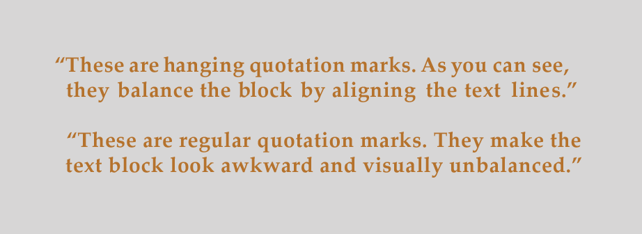
This is probably the third most overlooked thing in amateur publishing—and it’s a detail that adds beauty to the printed page (and to the web when you can achieve it). Without hanging quotes, lines look imbalanced and awkward. Know that for websites, adding hanging quotation marks is probably more trouble than most people are willing to go through. If you don’t believe me, check out this page for further reading. Here are the same sentences center-aligned rather than left-aligned (note there has been some kerning added):
This is an instance where short blocks of text do benefit from centering. Note you can further enhance your typography with curly quotes.
Hanging Indents
Hanging indents, now the standard in print, are also a bit difficult to produce on the web. WordPress’s Classic Editor had an extended tool that provided customization without CSS, but hand coding has been the more common method. I don’t know of a way to do it with Gutenberg blocks (the new way to design), but know this: it’s completely acceptable on the web to use block style rather than indentations (because of the limitation of most CMSs). I personally find block style (the style on this page) easier to read. What do you think?
*Note that if you still use Classic Editor in WordPress, you are missing out on a lot of great features offered through block design.
Incrementally Scaled Headings
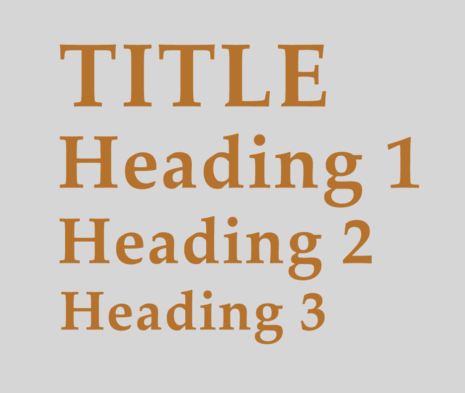
Headings in print look better when scaled incrementally with visually obvious differences in scale (but not too dramatic). Of course, titles should be the largest. Headings may also be colorized to contrast with body text, but, as with other color considerations, use restraint. Too much color confuses the reader. We are always scanning for visual patterns when we read, so try to keep your design in line with user expectations.
Headings for the web should follow the same incremental principle, but more importantly, they need to be hierarchical to be semantically correct for proper Google indexing. In other words, each page should have an H1, followed by an H2, then H3, and so on. No skipping headings! This is important!
Skipping headings is one of the most common mistakes I see on web pages along with not having titles or H1s. I’m straying into SEO territory now, but do look for a future SEO article. As with the printed page, your headings should be incrementally sized in a predictable, pleasing matter. Some themes may not be styled correctly. If possible, style them as you want using CSS or global controls rather than reinventing the wheel on each page.
Body Type Scale for Print
I talked about body text for the web, but being readable on the page is also important. Tiny books and their accompanying tiny text are cute, but who do you want to read your work? I want my work read by as many people as possible. Of course, I love type, and I also want my work to look beautiful on the page, so there may be compromises to be made. As a reader, if type is too small, too narrow, or too light (as in using gray ink), my eyes get fatigued, and I’m less apt to keep reading it.
Usually, 11 to 12-point fonts are a good reading size. Some 10-point fonts may be really, large, however, so there’s no hard rule, although there are plenty of university and business style guides that you may have to comply with in your publishing journey. But when designing your own book for yourself, one thing you might do is print some pages of your text and ask friends or family (with varying degrees of visual acuity) to be your test readers.
Serif fonts are best for the page, and there’s a reason why Times New Roman is so pervasive—it has a perfect balance of weight and contour to be pleasing to the eye. There are many other fonts, however, that look great on the page. Of course, you’ll want a font to complement your poem, story, book, or personal style too.
I love sans-serif and slab-serif fonts—the modern feel and sleekness, but would use a slab for a heading, never body type. More and more these are used in books, and, as I mentioned, a mix of two fonts on a page can also provide some visual interest (think heading, chapters, or author names) while offsetting the elements.
For accessibility, many web principles also apply to print. If you want your text to be readable by everyone, then design it for everyone! There are font designers who specialize in accessibility. Check out this free, downloadable Atkinson Hyperlegible Font at the Braille Institute, an attractively designed typeface, incorporating recognizable footprints and clearly delineated forms. Download it here.
Leading, Tracking, and Kerning
The last thing I’m going to mention is leading, tracking, and kerning. When making graphics and headings, taking the time to make your line width and the spaces between your letters and words is the finishing detail that sets your work apart from the amateurs. Kerning is applied between individual letters, and tracking is spacing applied to a whole block of text. Leading is the vertical space between lines.
While most fonts are designed with “ideal” letter spacing, I’m sure you’ve noticed some letters look crowded while some have too much space. While there aren’t a lot of controls for this in CMSs, your graphics applications include fine-tuning controls to add a touch of professionalism to your page design. Note, in programs like Photoshop, you can also use these controls to make hanging quotes (*see above). There may be instances where adding line space also gives your text room to breathe. Enlarged excerpts are just one example.
Tweaking the space above and below headings is also a way to fine-tune your typography, both in print and on the web. Note that I haven’t yet tweaked my CSS on this website, but doing it at the styles level would improve the typography on every page. Not all CMS systems give you easy access, although most paid accounts give you the option to add CSS to the pages (it’s better done at a global level, however). In WordPress, some third-party add-on blocks might give you that level of control.
Summary
Arming yourself with a few typographic conventions can enhance your design skills and make your poems, self-published books, and websites look more professional (and accessible). Here are the highlights:
- Use proper heading structure with incrementally sized headers
- Use em or rem font settings, or, if not available, use 16 px for body text
- Use contrast to make your fonts read easily (and learn about contrast settings)
- Avoid large blocks of centered text
- Use sans-serif fonts for web body text for accessibility
- Use hanging punctuation when you can (this is more difficult on the web)
- Utilize leading, tracking, and kerning to fine-tune your body text and/or headings
- Limit your color and font combinations to two or three
- Use a color tool to plan your color scheme
- Visually organize designs using a grid, paying attention to the alignment of elements
- Make a style guide for your brand, and include your web assets and your print materials
- Give your text ample margins so it doesn’t look crowded
- Treat the positive and negative spaces like they are equally important
The beauty is in the details, folks. Typography is an art form, and the more we respect it and tweak the details, the more it can honor the creative work it presents. When we spend a couple of extra minutes on our social promos, literary reading promos, websites, and book designs, we’re adding to our credibility and celebrating writing, writers, and publishing.
If you need a website, book cover, book trailer, graphic design, or other creative services, feel free to contact me.